The Real Color Wheel & How it Can Help You Get Dressed
Color is amazing.
It can evoke feelings—it can calm us, excite us, make us hungry, and more.
Unfortunately, a lot of what people are taught about color is just wrong. This article will give you a few little-known color facts, and it should give you some new ideas of how to work with color.
The Real Color Wheel
Most people were taught that red and green are opposites, or complimentary colors. That's false.
This is a color wheel that matches Sir Isaac Newton's original idea for how the spectrum is divided. This clearly shows that red & cyan are opposites.
If you're not really familiar with the word cyan, then this next section should be helpful.
Cyan vs. Indigo vs. Azure
When our ancestors were surviving in the wild, they didn't really need to tell apart different blues. Aside from the sky, the ocean and some flowers, there isn't much in our world that's blue.
That's probably why we refer to a full 25% of the color wheel as blue (the lower left quadrant), and we're generally not that good at telling different blues apart. Here's a cheat sheet for the different blues, plus turquoise which gets easily confused with cyan.
Indigo (the "indigo" in ROYGBIV)
Azure (halfway between indigo & cyan)
Cyan (the "blue" in ROYGBIV)
Turquoise (halfway between cyan & green)
A Word on Olive Green
This is one of the strangest things I've discovered about color. Olive green is actually dark yellow.
The two blocks of color you see here are the exact same hue. The only thing that makes them different is the amount of black. To fully appreciate this, understand that black and white do not change hue, they only change lightness and darkness. This is simply what dark yellow looks like.
If you take this photo of these Harris Tweed shoes into any photo editor with an eye dropper tool, you can easily find out that their hue is yellow and not green. In fact, it's a canary yellow that's bordering on amber. How amazing, then, that our eyes see this as green.
I saved you some work. The bottom block in the image below is the actual color I pulled from the suede on this shoe, using the eyedropper tool in a popular photo editor. The top block is what I get when I remove all black and white.
So why does this matter? Well, you can use olive green like yellow, for one thing. Whatever looks good with yellow, might just look good with olive green, too.
Putting it All Together
So you learned that the complimentary colors widely taught are wrong. You learned about the difference between the various colors we call blue. You also learned that olive green is just a shade of yellow. Now what?
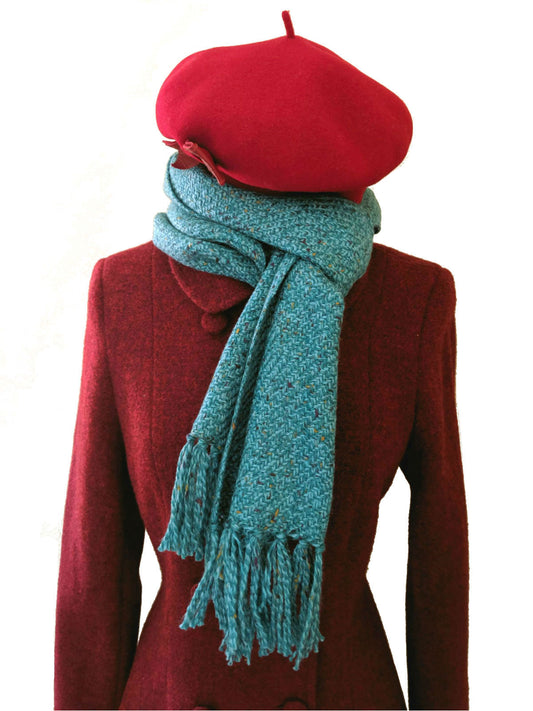
You can try using this knowledge to put together complimentary color schemes, analagous color schemes, triadic color schemes and more. The outfits shown in this article were complimentary, made of direct opposites on the color wheel. An example of an analagous color scheme would be pairing indigo with cyan, because they're adjacent on the color wheel. An example of a triadic color scheme would be pairing cyan with yellow and magenta (which forms an equilateral triangle on the color wheel).
If you were using the color wheel that most of us learned as kids, with red across from green, it means all of your color schemes would be a little off. Hopefully this article will give you a bit of an advantage and a fresh perspective the next time you're getting dressed.